
Downtown Nanaimo
Giving the historical area a
reputation it deserves.
Procreate | Illustrator | InDesign | Photoshop

A Bad Reputation
Downtown Nanaimo gets a pretty bad rap with the locals. Filthy, crime-ridden, dangerous, difficult to navigate, you name it. If it’s a bad adjective, downtown Nanaimo’s probably been described that way. It’s a shame because it’s home to so many wonderful local businesses, artists, and historical buildings (and food!) How do you give downtown Nanaimo a better reputation and encourage both locals and tourists to explore?

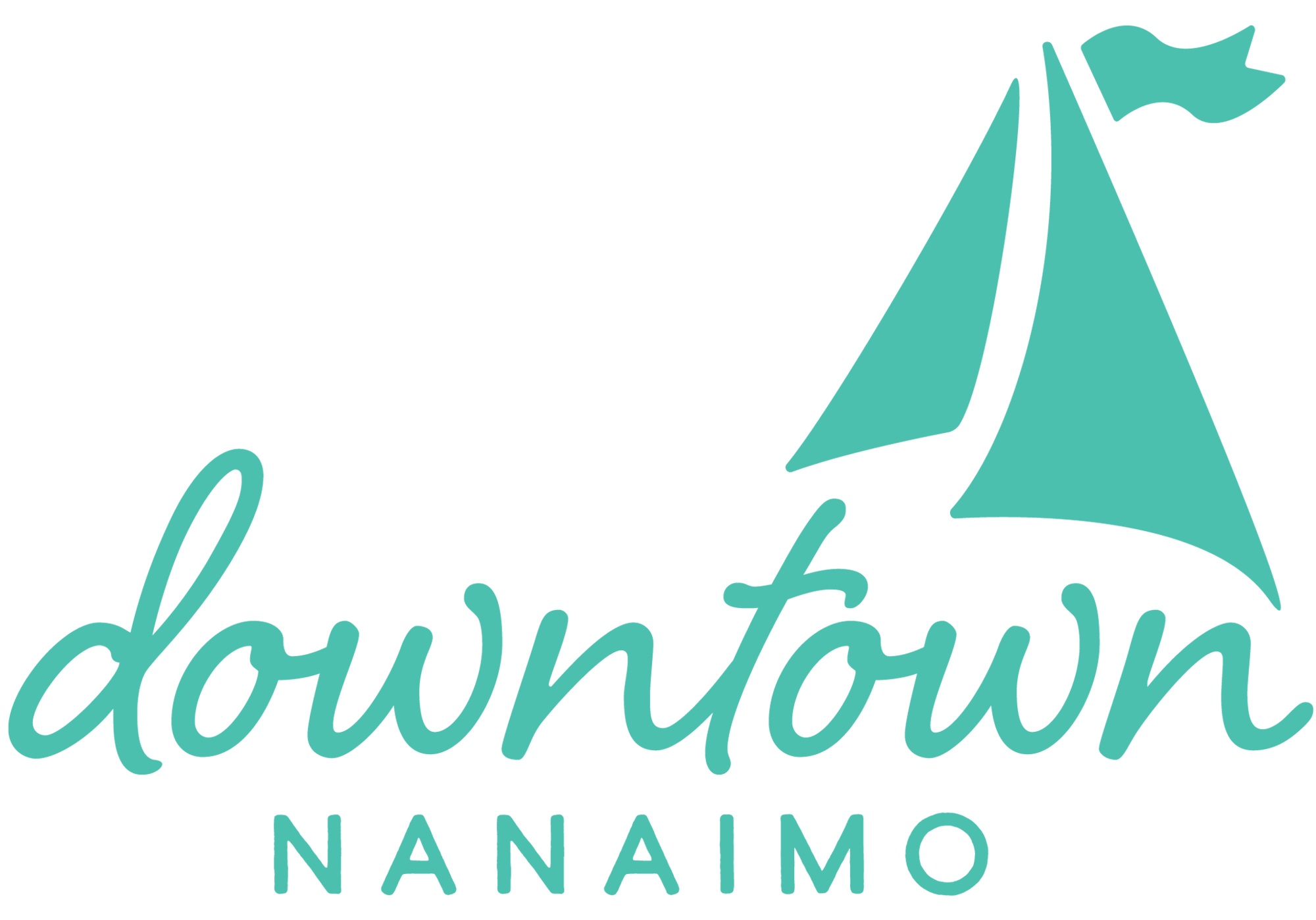
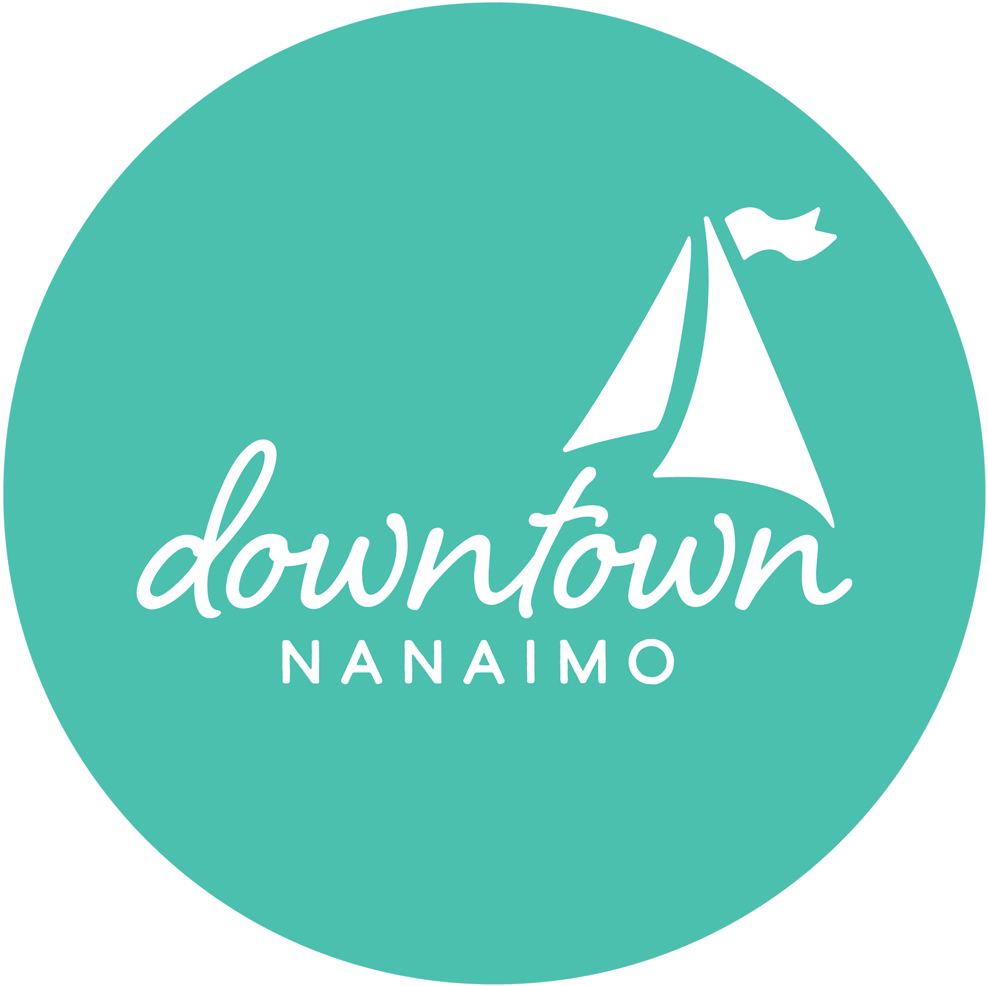
sailboat and water
Exploring Downtown
I started off by exploring downtown and what it had to offer. I walked historical walkways, explored the harbour front, and partook in many of the goodies you can find downtown (arguably the best part of the research phase.) I also asked people that I knew how they felt about downtown. Most people that I spoke to thought the downtown area was really awkward to navigate with not many maps or cohesive direction signage. They also felt downtown was really dangerous and dirty, and what it had to offer wasn't worth the trip down there.
People needed to be shown that
downtown Nanaimo had a lot to offer and that it's safe to explore the area.
In order for Downtown Nanaimo to be seen as friendly, easy to navigate, and worthy of exploration, I decided a comprehensive branding and wayfinding system would be the way to go. I wanted to separate the districts as well, to encourage exploration of all downtown has to offer..
Solutions
Nanaimo is called the harbourfront city, and I wanted to include its harbourfront history in the branding as a nod to the past. The colours themselves are vibrant and inviting.
The districts are separated by three distinct colours, blue for Waterfront, green for the Arts District and yellow for Old City Quarter.
They’ve also got their own distinct illustrations, inspired by vintage seafaring drawings. I drew these up in Procreate and used them throughout the project. To bring in more of a cheerful, tourist town vibe, I chose a script inspired from vintage postcards, as well as a rounded serif for some added friendliness and a nod to the historic history. The sans serif is highly legible and friendly as well.
bright, inviting colours


To tackle the navigation issues, I created steel light posts, street banners and a map, as well as various wayfinding signage. The light posts are a unique way to showcase the branding, but they also feature an illustration on the back along with a colour and the name, to show you which district you’re in.
all posts are white steel


The logo is cut out at the top of the posts to reinforce branding, but also allows light to come through when it's dark.
district branding on back

The map itself follows a similar design to the street posts with the logo cutouts in the steel for added cohesion and brand recognition. Locations on the map are coded in a colour and number system,, such as restaurants and parks, to encourage exploration.
lots to explore!


logo cutout
I also felt it was important for people to show their appreciation for Downtown Nanaimo’s new identity through merch. Using the branded illustrations, I made some Photoshop mockups of T-shirts, one for each district, as well as matching keychains. Merch is unisex and utilitarian, showing that Downtown Nanaimo is for everyone.

